Choose what the colour must work beside
A paint sample does not exist in isolation. It will sit beside flooring, curtains, furniture and the light used in the room. Before ordering samples, identify the retained finishes and the practical uncertainty: whether a pale colour looks too cool beside wood, whether a dark colour overwhelms a narrow wall or whether two adjacent finishes appear mismatched.
Choose a small shortlist that addresses that question. Too many similar samples can make observation less disciplined and encourage decisions based on whichever patch was viewed most recently. Keep the colour names and codes on the back of a sample board or in a separate index.
Decide the intended final product and sheen early enough to discuss sample limitations. Benjamin Moore's FAQ distinguishes its colour samples from final-use coatings. A sample is evidence about appearance under particular conditions, not a complete demonstration of the final coating's service performance.
Prepare comparable samples
Follow the sample product's instructions for substrate, application and drying. Use comparable sample sizes and backgrounds so one colour does not benefit from a larger or brighter display. If using movable boards, ensure their material and preparation are appropriate to the sample system.
Do not paint sample patches over an unassessed damaged or suspect surface. Arrange the relevant assessment before disturbing old coatings. A colour exercise does not justify sanding, scraping or other preparation outside a safe and authorised project plan.
Record the product and sheen represented by each sample. Benjamin Moore's finish guide explains that sheen affects reflected light and appearance. If the final sheen differs, keep that as an explicit uncertainty to resolve with the retailer or decorator rather than assuming the sample is a perfect preview.
Observe under the light you actually use
View samples at the times the room is occupied: morning work, afternoon reading or evening rest. Note whether daylight, lamps or both are in use, and whether curtains are open. Keep those conditions beside each observation.
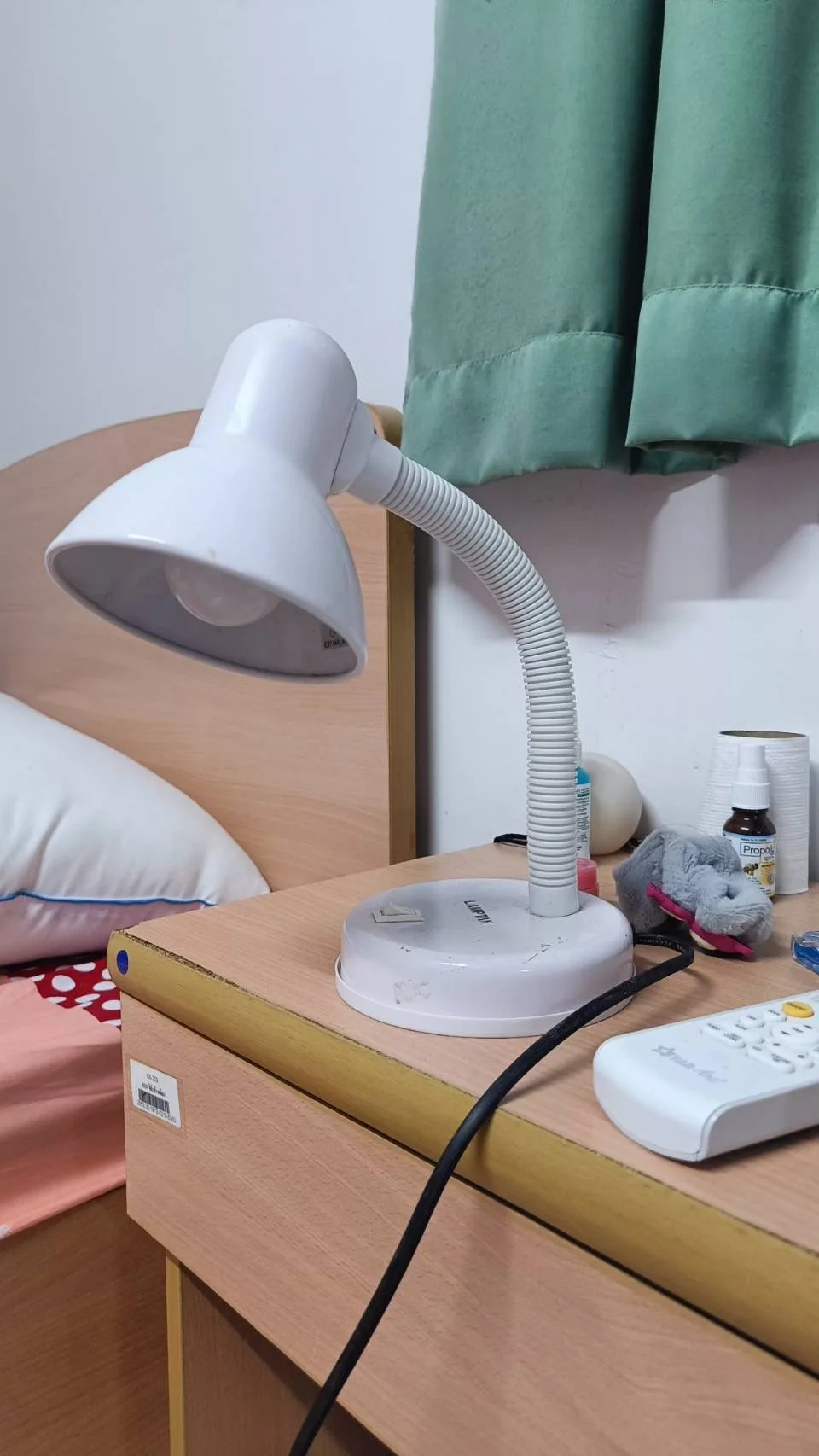
The flexible-neck lamp sits beside a curtained window, identifying an artificial light source to include in a room record. When comparing your own samples, note whether that lamp is on and whether the curtains are open, then view the sample directly on its intended wall. The photograph does not establish lamp output or colour accuracy.
Photo & usage
Thidapa · CC BY-SA 4.0 · Source. Display copies resized and encoded as WebP; no instructional details were fabricated or removed.
Move a board to the intended wall where the sample method permits, without damaging the surface. A colour viewed flat on a table receives different light from the same colour on a vertical wall. Check more than one relevant wall if the room has strong directional light.
Do not rely on a phone photograph as the final colour reference. Camera processing and display settings can alter appearance. Images can document where and when a sample was viewed, but the decision should include direct observation in the room wherever practicable.
Use a comparison card instead of memory
The following illustrative observations show a way to record differences. They are invented descriptions, not findings from tested paint colours.
| Condition | Sample A | Sample B |
|---|---|---|
| Morning daylight, curtains open | Appears cooler beside wood | Appears closer to retained fabric |
| Afternoon daylight | Still acceptable on desk wall | Looks darker in corner |
| Evening lamps | Looks neutral to household | Looks warmer than desired |
Each sample has three recorded conditions. If evening use is the room's main function, the household may favour A despite B's morning match. There is no numerical score that makes that preference universal. Record which condition mattered and why, then check whether a different lamp or retained textile is also changing the judgement.
Compare with a controlled set of retained materials
Place the relevant fabric or finish sample nearby without covering the paint board. If the actual object is large, view the board beside it in the room. Compare one important relationship at a time so competing patterns do not make the observation impossible to describe.
Keep temporary decorative objects out of the decision unless they will remain. A bright moving box or coloured sheet near the sample can influence the impression but has no place in the final scheme. Record the intended materials rather than trying to neutralise every object in an occupied home.
If a finish is still unselected, state the dependency. Do not approve paint on the assumption that any later curtain will match. Choose which material sets the boundary and obtain the needed sample before committing to a non-returnable purchase.
Set rejection boundaries before selecting a favourite
Write a few practical boundaries: acceptable under evening lighting, compatible with retained flooring and available in a suitable product. A colour that fails an essential condition can be rejected even if it looks excellent in the shop.
Separate dislike from uncertainty. “Too dark for the household's preference on the desk wall” is a decision; “not viewed in evening light” is missing evidence. Obtain the missing observation rather than treating uncertainty as a reason to buy another dozen samples.
Ask the supplier about the final coating's suitability and instructions. The reviewed N627 technical sheet illustrates why product identity matters beyond colour. Do not choose a coating solely because the colour is available if the surface or project requirements call for a different system.
Confirm the selected specification
Record the colour code, manufacturer, final product, sheen and intended surfaces. Check the order label against that record before application. Keep the chosen sample identified until the main coating is supplied, and resolve any unexpected label difference with the retailer.
If the final product or sheen changes, revisit the appearance question with the supplier. A substitution may be sensible, but it should not silently inherit approval from a different sample system. Retain the original observation card so the reason for the decision remains visible.
Do not claim the sample exercise predicts every future condition. Different seasons, furnishings and lighting can alter appearance. The useful conclusion is narrower: the household preferred this option under the named conditions and confirmed a suitable final specification.
Close the observation record
Save the short comparison card with the paint order and room notes. Dispose of or store sample products according to their instructions and local arrangements. Do not use a colour-sample formulation as a final finish where the manufacturer says it is intended only for sampling.
After the room is finished, compare the result under the same conditions used in the card. Note a material mismatch for discussion without inventing a cause. Application, substrate, lighting and product identity may all need checking.
The sampling stage is complete when the decision has a clear reason, the final coating is identified and the remaining limitations are understood. It should reduce uncertainty enough to purchase responsibly, rather than promise an unchanging colour experience.
Avoid letting adjacent samples decide the result
View each shortlisted sample separately as well as beside the others. Strong neighbouring colours can change the impression of a pale sample, and a crowded patchwork may exaggerate differences that matter less on a complete wall. Keep the observation method consistent across the shortlist.
If using movable boards, change their positions deliberately and record the wall and time. A sample repeatedly placed in the brightest spot should not win by accident. Where a board cannot represent the final surface texture, state that limitation and ask the supplier how best to confirm the appearance.
When household members disagree, compare their observations under the same conditions before adding more colours. The disagreement may concern evening use, a retained object or sheen rather than the colour reference alone.
Keep a sample beside the retained finish only while observing it, then restore the room’s ordinary arrangement. Record whether the comparison used the actual material or a small substitute sample, because the surrounding area and texture can affect the impression.
THE REFERENCE FILE
Sources & scope
Documentation reviewed 1 Nov 2026. Examples are illustrative; this article does not claim hands-on product testing. Follow the instructions for your actual material, model and location.